 Time to have some fun! As discussed in a previous blog post, as part of a set of launch activities being planned to help provide a marketing splash for Drupal 8 when it launches, we’re developing a brand identity for the release. Today we’re excited to show some concepts and ask for feedback.
First, a note about the designer. After reviewing more than 20 creative portfolios and talking with 10 firms and freelancers, Mogdesign was chosen as the design firm. There were many qualified candidates and it was a difficult choice. Mogdesign, located in Slovakia, has deep roots in the Drupal community and does excellent design work. In fact, Mogdesign created a great brand identity for Drupal 7.
In the previous post we asked for input on what the logo should convey. Of course a logo can only communicate so much on its own, and accompanying content will do much of the heavy lifting when it comes to conveying messages. But it’s worth briefly revisiting some of the comments.
Several comments mentioned flexibility and simplicity, and that the brand needs to inspire confidence to audiences including the community, users including IT pros and marketing, and people who are new to Drupal. A few commenters noted the tone should not be too serious, but not too fun on the other side of the spectrum.
We invite you to review the concepts in the below slideshow and provide your feedback in the comments here on the post. We will leave these comments open for a week from today and then Dries will choose a direction and have final sign off on the finished logo. What are "concepts"? Concepts are visuals designed to help determine a direction. They are typically a single color (you will notice these are all the same blue), and may have additional color or other revisions before finalization. The goal will be for Dries to show the new logo during his keynote at DrupalCon Prague.
Thank you for your input and helping with the process!
Update 1: The slideshow is below. If you have trouble accessing, here is a direct link to Photosnack, where the slideshow is hosted.
Update 2: Some have noted the relationship of the Drupal wordmark to some of the logo concepts looks off in size and positioning. I wanted to note for the record that this was not the designer's doing or intent. I tried to emphasize the logo to make them larger for easier review, particularly on mobile devices. In hindsight, that was probably a bad idea. The positioning of the concepts is not meant to show what the relationship of the wordmark to the final logo would be, but only to show how the shapes look together. Hopefully you are able to get a sense of that. And thank you for all the thoughtful comments. Great stuff.

Comments
Concept 6 is the clear winner
Concept 6 is the clear winner for me! Integrating the 8 with the drupal shape is clever, and neither is destroyed. All the other concepts aren't as clean.
1, 1a, 4
I think 1, 1a, and 4 are all nice possibilities.
Concept 1 & 6
I like both 1 & 6. Though I prefer 1 over 6. Great work!
1 and 1a look like they have
1 and 1a look like they have a 'g' in them. Did Google buy Drupal? :-)
6 says yay, tho I'd make the top circle of the 8 smaller.
Love 5, 6 is good too.
I guess others aren't digging the flower-created-by-Druplicon pattern, but I really like it. As a second choice, I'll echo others that I like #6, because it's subtle but identfiable.
1/1a is kind of interesting but doesn't speak to me as much as the others. But I guess third choice for me.
Please don't do anything like an 8-ball (#2). An infinity symbol could be interesting (#3), but I don't really like the execution of this -- the negative space could be two Druplicons, or the symbol could be more like a möbius strip, but right now it just looks like a (boring) racetrack.
Love the diversity of options here!
1a FTW
1a gets my vote, clean integrated design.
Don't replace our brand with a number.
"8" is just a number. The logo we have now is better than the proposals.
Couldn't agree more! Should drop numbers altogether.
I see somewhat of a tendency (web browsers, ipad, etc, etc) to drop version numbers altogether and just focus on the actual brand.
Does "8" really matter at all? Not in my opinion! The next release is "the new Drupal", and, quite frankly, that's enough from a marketing standpoint.
In all the concepts above, the word "Drupal" looks exactly the same as it has for a couple years now. IMHO, we gotta drop these version numbers and focus on what's really important which is the Drupal brand.
I think version numbering is
I think version numbering is very important for Drupal because of non-backwards compatibility. All the other projects / products you are talking about (browsers for example) drop version numbering because they are auto updating for one.
I think it is better to compare this version numbering with for instance the Playstation / Xbox version numbering (quite a difference if you have a Playstation 2 or 4 at home).
With that being said, I think the 8 should be able to function on its own as well, with that in mind i like the following ones the best:
1a - Tilting of the 8 makes the Drupalicon feel more open and interesting on the diagonal axis.
3 - infinite, always like that one, that shape just intrigues, should be used with a tagline though, else it doesn't communicate anything. (corny: infinity possibilities / infinite resources / infinited ...... )
4. Again a warped / titled 8 works, makes also for an interesting shape, I like flat more than other things, keep it simple.
A few notes
In general: It is an common design-error to believe an 8 just exists of two circles. Graphically this never works out well. It forms a very broad centre part. The stroke of the 8's top-circle should have the same width as the bottom one.
Concept 1:
The different 3D-perspectives in the Drupal-Drop are disturbing. The tilted 8 makes it look week. The modified drop is good and gives the logo some dynamics.
Concept 1a:
Looks like a Pre-Version to Concept 1. I assume the designer wasn't sure a about the 3D-look and therefor decided to include a simplified version, too.
Concept 2:
See my general notes at the top. Here you can see the problem using circles in circles. Optically the blue circle looks somehow 'compressed' and not like a proper circle. The designer should adjust the alignment of the vertical version (at the top) - the circle seems to be slightly to far to the right. While mathematically aligning the logotype and and the circle is correct, visually it isn't. The reason is that the logotype's ™ should not be or just slightly be included in calculating the alignment.
Concept 3:
Conceptionally the best idea - visually boring and way to tall. Why doesn't the designer try to implement this idea in other concepts?
Concept 4 and 4a:
See Concept 1.
Concept 5:
The 8 is typographically awful - see my general comment. The idea of using 8 petals as part of a 'flower' is nice. I think the petal-drops shouldn't be that dynamic.
Concept 6:
I wonder how the 8 would look like if two drops would be used. This could visualise the modular structure drupal has. Again, the drop shouldn't have this dynamic form and should rather be mirrorable.
At this point I'd go with concept 6. But as Greg Anderson stated earlier: ' "8" is just a number. '
Proportions
One note about the proportions on some of these. I revised a few unbeknownst to the designer to try to make them all about the same relative to each other. My fault on that, not the designers and it will be fixed before a final direction is chosen. Thank you for taking the time to comment!
Personally I like just re
Personally I like just re-using the wordmark and the suffix with a nicely formatter number '8' instead of a new logo every single time we make a major release. But I suppose marketing would overrule me. I doubt what will bring users to Drupal 8 is the logo. It will be how we market the improvements and features in Drupal 8 that makes the biggest difference.
Couldn't agree more
+1
Agree
Totally agree Dave, this is one very small part of the marketing push for Drupal 8. It will be very important to communicate what Drupal 8 is all about in public relations efforts, community "spread the word" efforts, etc.
1a
1a
Concept 1
I LOVE Concept 1! My degree is in fashion design, and this logo has vitality. Is this a male versus female debate? I know men tend to like non-abstract images. In my female mind, there is no question that Concept 1 clearly outshines the rest for its appeal.
Concept 3 "Infinite / Loop"
Concept 3 "Infinite / Loop" can be a start. It's too bold and too tall if you compare it with the word.
All others concepts does not communicate nothing to me, i saw them as a simply 8 number with a stetical work on them
Proportions
Just a note on concept 3. I changed the proportion to make it larger and it's obvious to me now that it is too large! My fault. Thanks for commenting!
1 was close. 5 looks great.
If it wasn't for the two perspectives in the loops, then 1 would look great. I'd love to see 1 again, with a consistant perspective on the 8.
Alternatively, I thought 5 was fresh, balanced, and gave it some uniquely Drupal character. Didn't like the "8-ball" or "infinity" look.
6
6 is beautifully simple. Elegant form and function
Going through my thoughts were: Both 1's are good.
And 5, too. Began counting the points and didn't notice it was a drop. My thoughts drifted to flowers and octopi. Not unpleasant associations, though also not Drupal. And then 6 went ding!
Concept 6 is unmistakably Drupal. And it's as clear as the variant, 1a.
And just as I was about to press 'Save' on this, I wondered what Concepts 6 and 1 would look like together.
See for yourself, here : drupal8-concepts6and1-merged.png
1a and 6
1a is the first, then 6.
concept
Heh... I like best it's concept the best. 6 was the closest to my pick but still lacking.
1 - thought we were done with the 90's 3D design?
1a - clean, elegant and scalable but the offset 8 makes it look like some koo-koo eyes.
2 - where's the drop? A circle is not a water drop, the brand of Drupal...
3 - can't tell if it's an 8 or infinity... Didn't notice the droplet until the second time around.
4 - again with the 3D... First Hollywood, now Drupal... The question you have to ask about the 3D: "is it scalable?" A good designer knows that a brand must look good on print, digital, fiber and has to be able to enlarge or shrink with no quality loss. When talking screen printing with shirts, that would probably be at least 2 colors if not three to (not including the shirt color as a color) get the true effect (which is more difficult) and then your cost goes up. Try using a 3D design as a small logo stitched on a shirt... Gonna look like crap. Just because we "can" do 3D, doesn't mean we should. The other issue: you're locked into one variant of colors. Switch the background to Drupal blue and the logo to white. Gonna look like crap without some additional color work. The logo should be able to take on any set of colors without altering the original design. Only other solution is a designers best friend: a border surrounding the whole thing (hint of sarcasm)
4a - more 3D and too many colors.
5 - never saw the water drop until I read the comments... Too many colors for screen printing, would look like crap shrunk. It's a flower, not the Drupal brand.
6 - personal fav but the icon is too subtle. I personally think it might look better if the 8 was leaning left. 2 colors (including background) clean, simple and effective. Need some variants of it.
May the quest continue!
autocorrect
Dang phone autocorrect...
First line should be "I like brst t's concept the best. 6 was the closest to my pick but still lacking."
autocorrect
Dang phone autocorrect...
First line should be "I like brst t's concept the best. 6 was the closest to my pick but still lacking."
My vote goes for 1a
My vote goes for 1a
my vote also for 1a
my vote also for 1a
Not a designer but I "prefer"
Not a designer but I "prefer" 1a when I browse through the proposals. I don't like the 3D effect of 1.
Sorry, I don't like any of
Sorry, I don't like any of them. Also I don't feel it should be up to the community to decide. The designer should have some research and reasoning to backup a single logo design. I would've rather seen, "here is your logo, this is why".
My vote for logo would goto the one in the issue queue about the Drupal 8 installer. There were two druplicons on top of each other, the top one upside down. They were slightly off centre to create the number 8.
Searching for install in the
Searching for install in the issue queue brings up pages of issues. Do you have a link?
Think I found it: https:/
Think I found it: https://drupal.org/node/2030027#comment-7617843
If we had to have a
If we had to have a "different logo" for Drupal 8, I'd pick this one.
I like this one way better
I like this one way better than any of the concepts above.
I like this one best also.
I like this one best also.
Agree 100%
Agree 100%
nr. 6
Nr. 6 has my vote. (The '8' can be smaller in comparison with 'drupal')
6 for the win!
6 for the win!
Concept 6
No 6 is the best by far.
Should go well in Russia.
Should go well in Russia. That would be the best about this design imho. ;)
1a has my vote !
1a has my vote !
A logo needs to be simple ! Moreover, this one (and the 1) both keep the "Druplicon" identity that Drupal always had...
Concept 4 makes a hit!
In order of preference :
In general I like the idea of the shadow, it gives the feeling that 2 entities (community members along with Drupal gurus, Drupal API + Symfony) worked together to deliver Drupal 8.
It inspires a transition to a new way of doing things, while keeping legacy of previous versions.
Somewhat like marrying modernity and tradition.
At least that's how I see it! ^^
None of dem
None of the designs made me go wow. Some made me go ugh (1,3,4,5 especially). I am with Dave Reid on this I guess.
Also: timmillwood has a good point. This shouldn't be put out to the community which won't be able to built a useful consensus anyway. (On the other hand: Let us rage beforehand so that we don't feel the need to scream about the logo ultimately chosen).
Couple of thoughts...
Couple of thoughts...
Thanks
Thanks for the comments Graeme! Agree on the imbalance of the wordmark on 3 - just so you know I revised it unbeknowst to the designer.
No 6
I vote for no6. Clean and clear. Nice touch.
Logo Version Without Number 8
It would been nicer to see a version with out using the number 8 on it.
Design feedback from a dev
So I say the below as a devleioper and in no way as a designer. Maybe if the rationale behind each concept was stated it might make each version more understanable as in how that decisison was reached.
1. I dislike the 3D effect, it doesn''t really work and is a tad too overpowering.
1a. I'm not a fan of the tilt, just looks odd.
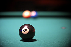
2. Looks like a snooker ball - http://freebiespress.com/wp-content/uploads/2010/02/Snooker-Ball-Design.jpg
3. I kinda like this one, the '8' is is aliitle overpowering again though
4./4a. Again the tilt and 3D.... not for me
5. flower design is kinda nice, maybe a tad overcomplicated though.
6. My personal favourite, doesn't quite balance though
more feedback
Someone at work said #6 looks like a penguin, Just thought I'd mention it as well...
concept 1-- great sence of
#6 FTW!
#6 FTW!
no good choice?
I agree with some people above. None of the designs made me go wow either. In most cases, the "version logo" way overpowers the Drupal wordmark in size. I men if the relative sizes are to be considered final... This is very strange in 2, especially 3, etc. If we are to choose from only these 1 or 6 would be maybe good, but 1 looks more like a very drunk/confused Druplicon with huge eyes sideways... If you know Druplicon, it just looks like Druplicon was kicked hard and the eyes popped out, like in a cartoon.
I'd love is more subtle variants would be considered. Eg. take into account Kevin O'Leary's quick mock from the issue queue that tim.millwood mentioned above, which is much more subtle and does not overpower the wordmark, it merely complements it. In this sense, in agreement with Dave Reid definitely. (Disclaimer: both Tim and myself work in the same company with Kevin).
Thank you
Thanks for the thoughtful comments Gabor! One note about the size of the Drupal wordmark. These do not represent what the final logo would look like in relation to the wordmark. I actually pumped up the size of the logo portion relative to the wordmark so they would be easier to review on the screen, paricularly if people are using mobile devices. I see now that I should not have done that! :-)
You can rest assured that the final logo will be appropriately sized in relation to the wordmark.
1a or 6
I don't like the offset rotation effect on concept 1, it makes it messy and reminds me of the printing error you can get with processes that print each colour separately, when the paper moves between the colours so they aren't aligned properly. 1a solves this problem and is actually quite nice.
2 lacks distinctiveness
3 resembles a race track or the infinity sign. What do either have to do with Drupal?
4 has the same problem as 1, although it might work without that effect. 4a is even worse.
5 is too complicated, and you can't really see it's a druplicon
6 is probably the best of the lot. It's also already got some brand recognition from being on the Drupal.org homepage for a while, which is a good thing but would make Dries' big reveal a bit of an anticlimax!
+1 #6
+1 #6
+1 concept 6
+1 concept 6
+1 - Concept #4
+1 - Concept #4
I like brst t's concept the
I like brst t's concept the best. 6 was the closest to my pick but still lacking.
drupal8-concepts6and1-merged.png
Thanks. I certainly can't claim sole ownership of it as a concept in the same way as the others. 'Concepts 6 & 1 - merged'
Reflecting on it again with fresh eyes, the druplicon is like a an even-keeled hull or a compass providing bearings. And the slant in the top half is a bit like wind. Dynamic and even-keeled. Travels well.
(My comment was intended to
(My comment was intended to follow philsward's. Strange threading action -- the first post nested and second one didn't. )
Mine wasn't threaded where I
Mine wasn't threaded where I replied, either. Hmmm.
6 looks like a good direction
6 looks like a good direction and 3 is OK, but none of them really jump out at me.
Also, the embedded slideshow doesn't show for me in Firefox. It's only showing in Chrome desktop, not even in Chrome mobile. Really, who's idea was it to use such a craptastic embedded tool? Of all the slideshow options for Drupal, did we go out of our way to find the least compatible?
Also, what Dave Reid said. Sorry, the logo is the least impactful, least relevant part of Drupal 8's marketing push.
Slideshow
I tested it on a few browsers but clearly it's not working for everyone. I added the link directly to the slideshow on Photosnack, so hopefully that works. Let me know if you still have trouble, and thank you for commenting!
Where is this logo going to be used?
Hi All,
Is this logo only going to be used in the initial promotion of Drupal 8 or is this going to be a global change to the main Drupal logo?
The main Drupal logo should stay EXACTLY THE SAME over time.
If this logo is only to used for the promoting the release of Drupal 8, then what this post really needs is some clarification as to why these logos fit our needs; an explanation of what a logo should do for us and why/how these logos do those things. If that information is already available somewhere else, then perhaps we just need a link to it.
For starters, logos should be simple, recognizable from a distance, and evoke some emotion. The simple Drupal Drop logo does these things. So does 1 and 1a.
Besides 1 and 1a, the others steer too far from the main logo for my tastes.
Cheers,
Jeff
No change to wordmark
Hi Jeff, thanks for the comments! This in no way affects the Drupal wordmark or the Drupalicon. Sorry if that wasn't clear. Here is a little more detail and background on the logo: https://association.drupal.org/node/18303
Number 5
I believe concept 5 really represents Drupal blooming into something new. This is very appropriate for Drupal 8 given the substantial shift in how it operates as well as a shift towards greater flexibility.
Drupli8on?
How about just using the existing Druplicon but changing his eyes to a number 8?
8 in the eyes
That's a better idea than any I see here. It has a visual hook that engages the audience.
I love #5 and #6
I gotta say, #5 speaks to me about the global span of Drupal. It reminds me of India a bit with that creative positioning of the overlaid druplicons (or drops since they don't have the eyes or smile).
I think #6 is by far the most professional and elegant. A simple, minimalistic and clever logo. Love it.
1a
I vote for 1a.
Well, where to begin...
I could spend a lot of time critiquing these but I think the volume of comments above syas alot. Overall I just don't see that alot of time and effort has gone into these. They are all too similar and none of them has that essential "visual hook" or double meaning that is what makes a logo truly memorable.
I's say send them back for another round.
Jozef clarified...
that actually these are short list of concepts chosen from a larger group by the association. That changes my view considerably. In the interest of transparency and collaboration I think it might be a good idea for jsayor to enumerate the criteria the association is using to select concepts, and perhaps to publish all of them. It would also help focus the discussion in this issue.
Ok?
None of these excite me. They are all OK at best. I like where the last slide is going from tarekdj.
I must say we need something that can last and if 8 is *infinite* then what is 9 when it comes out?
Hope to see this improve.
-Steve
8 ball
I had an idea for this a while back, check it out:
http://purkiss.com/img/dateam.jpg
1 rocks
Forgot to say - when I first looked at the concepts I really didn't like number 1 but I really do like it ;) So my vote is 1.
Good stuff
Thanks Steve I love the DA team creative!
Why?
I am a bit late to the party on this but here's my tuppence worth! I don't have an opinion on the actual designs (as nice as some are) because I don't think we need them.
For me the main logo and version should be fully integrated and consistent and I can't see the purpose of separate version number designs, it could actually have a detremental and counter productive effect on the overall branding. Why not just have Drupal and if the context requires it the 8 or 9 or whatever next to it?
A number doesn't need branding. By giving them one, we are almost highlighting that 7 and 8 are very different products and not from the same 'stable'. Yes I know they are different but is this the message that we want to send outside the community or should it be one of consistency and strategy.
Rich
#6
#6 is clever. I would like to see that concept further refined.
#5 is also nice to look at but I worry it migt be dated and diffcult to use in other branding materials besides a website.
4
Logo 4
love it.
Concept 6
I really like concept no 6. It has the old drupal logo inside and is really simple.
Concept 6 is the best
I really like concept #6, simple and neat
1 & 6
Concept 1 and 6, simple and beautiful :)
Concept 3 takes it all in my
Concept 3 takes it all in my opinion
6 is pretty damn good. Prefer
6 is pretty damn good. Prefer that over the others.
6 is good
I like #6, too
my favs
#1, #3 and #6
#6
Number 6 seems to be the best. Though I would work on the relative sizes between the 8 and Drupal
Concept 6
Concept 6
~5, 1
Kinda like 5, but would like to see a better 8 (more like an 8, less like infinity) - maybe the 8 from concept 6.
Also like 1. Implies movement.
1a, 6
1a, 6 get my vote
There is not much variety in
There is not much variety in these concepts. If I had to pick on it would be 6, but I think none is better. Back to the drawing board?
E - None of the Above
I don't like any of them.
I don't think any of these represent Drupal 8
Here, I made a logo that represents Drupal 8 pretty well. http://imgur.com/lzpr8Uz
Font used on the "8" is Josefin Slab Bold. Green color represents "Go time" which is what D8 represents in so many ways.
update ?
So if this is the concept drawings - it looks like theres a concensus around the "8" as a number is there any updates on designs :)
btw. if were going with an 8ball well that screams for Rockabilly estethics - so add fire & kickass to the top of it (yes fire & skulls make everything look cooler)
Renegade Drupal 8 Logo - Community Edition
Renegade Drupal 8 Logo - Community Edition :) http://bit.ly/184PwzK
Concept 1
For me concept 1 looks best.
#1 is #1
Simple and works as a favicon.
Agree!!
+1